Wednesday, November 16, 2005
Why does the Google Analytics UI suck so much?
Google Analytics launched this week, and has certainly had its fair share of teething troubles in the first couple of days - with registration suspended for periods as the servers stuggled to cope with the demand.
However, now that I've managed to get it set up, I'm very unimpressed with the UI, which is poor in a number of respects.

I'm also glad to see that there is the facility to export the data in alternative formats of tab separated data, xml, and as Excel data. However, this always seems to be restricted to the current view - I can't see a way to export all the data at once, which would be very useful.
Another disappointment is the poor support for printing - there is a "print" button, but all this does is hide a bit of the navigation - the layout of the remaining items is not adjusted at all to take advantage of the capabilites of the printed page. Compare this to Google Maps, which makes sure that printed driving instructions look good on paper, with a quite different appearance to that which is appropriate for on screen display.
Update: Found another problem with the map - when you click on a result on the map, it shows you a set of details in a popup - but the popup always appears below and to the right of the point. So, when you have a load of points in Australia to look at, the popups are truncated since they can't go outside the Flash borders, so you can't see the data.
However, now that I've managed to get it set up, I'm very unimpressed with the UI, which is poor in a number of respects.
- First off, it requires Flash, which is an unnecessary overhead (and having taken the time to download and install Flash in my browser because of it, I find my general browsing experience is now much worse - distracting ads now appear on websites that previously were quite clean, and I've suffered an attack of popups that have been missing from my browsing for years now)
- The meat of the data is within a seemingly fixed size rectangle, yet there's so much detail there that I need it to be resizable so that I can make it as large as my screen will allow
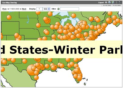
- The maps are the worst that Google has ever produced - yet we know they have great mapping technology, so why dont they use it? Using the right mouse button there is a zoom function offered, so you can drill down into an area of the map in more detail, but if you do, then all the text tooltips also get bigger, and since they are limited to the map rectangle, they are thus truncated and unreadable.
- The animation of elements is pretty annoying (for example bar graphs where the bars grow from zero up to their final length), and is wasting time - my need for web stats needs the data to be there for me to view instantly, not taking its time to appear as it currently does.
I'm also glad to see that there is the facility to export the data in alternative formats of tab separated data, xml, and as Excel data. However, this always seems to be restricted to the current view - I can't see a way to export all the data at once, which would be very useful.
Another disappointment is the poor support for printing - there is a "print" button, but all this does is hide a bit of the navigation - the layout of the remaining items is not adjusted at all to take advantage of the capabilites of the printed page. Compare this to Google Maps, which makes sure that printed driving instructions look good on paper, with a quite different appearance to that which is appropriate for on screen display.
Update: Found another problem with the map - when you click on a result on the map, it shows you a set of details in a popup - but the popup always appears below and to the right of the point. So, when you have a load of points in Australia to look at, the popups are truncated since they can't go outside the Flash borders, so you can't see the data.
# posted by zmarties @ 11/16/2005 09:08:00 pm 